I used to sit up reading these in the 90s and 00s, a little goblin who wasn’t yet good enough to complete these games without help. You reached out to me, guides writers, and you never even knew it. And the true marker of the dedication of these artisans can be seen in one thing: the ASCII art of game titles they put in at the top of their work. A true craft that has died out but deserves to be seen and celebrated. ASCII basically just means ’the standard way of displaying text on your computer screen’, but since humans are an enterprising lot, we have long used it to represent more than just display text. Example: I can make an ASCII smiley face. :D Back in the before times, before you could easily splash actual images onto the internet, ASCII art was a way to make your guides purdy to look at, and many guides writers really rose to this challenge. I do recommend you actually click through to look at the guides in their original format, not only because image compression mangles the crisp edges of the ASCII art a bit, but also because the guides themselves are often a joy.
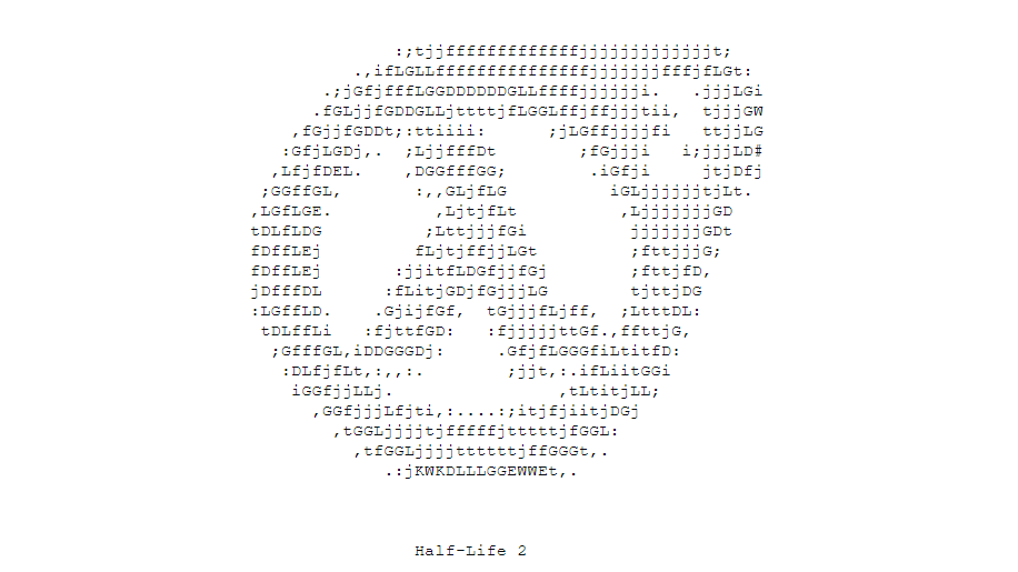
I’m a big fan of the use of upper and lower case for this Half Life 2 logo from Greg Slomin’s walkthrough. The use of negative space to form the ‘2’ is a genius touch.
This, from ChandooG’s Metal Gear Solid guide, is simple and classic, but I especially enjoy the inclusion of ‘A Hideo Kojima masterpiece…’. Alice0 also liked the use of ASCII art to make a cursive handwriting style title for the table of contents.
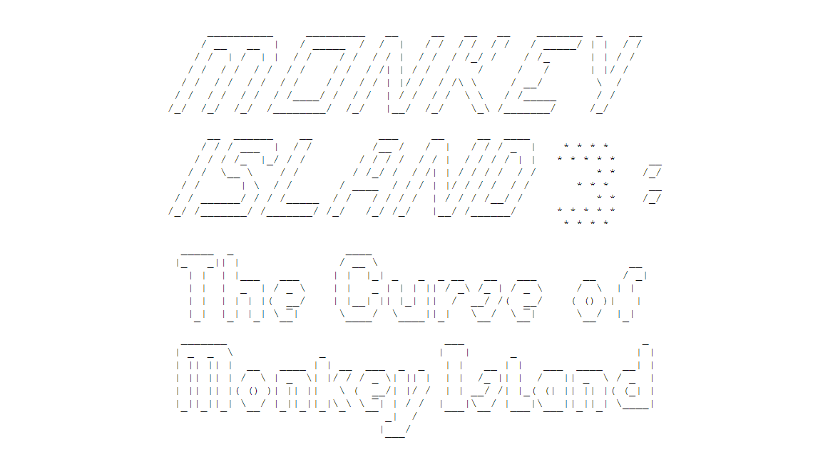
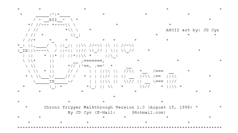
Big fan of this one by Iron Knuckle because it makes The Curse Of Monkey Island look like a spin-off from The Fast And The Furious, possibly fronted by Zac Efron, rather than a point and click adventure about pirates. This Final Fantasy VII one has a very similar energy.
In a similar vein, well done to Jeremy Martin, who gave his Day Of The Tentacle walkthrough a header with a tentacle in it.
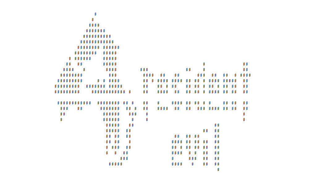
I couldn’t properly decide which Resident Evil 4 art to go with, there are so many good ones. In the end, I picked this from Adori’s Guide and Walkthrough (the full guide includes a lot of cool ASCII art by others, and Adori credits them all right at the top.)
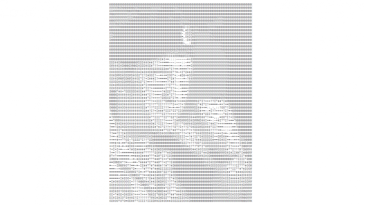
But a special shout out to Adnan Javed’s Resi 4 guide from 2005, GhostOfLegault’s art from J Southgate’s Resi 4 guide, and Heath Lynch’s Guide and Walkthrough, also from ‘05. The latter uses the time honoured technique of forming the letters out of smaller versions of the same letter, like a lovely matryoshka doll, so the big spooky 4 is made of 4s. I had a similar problem picking just one from the many amazing TimeSplitters and TimeSplitters 2 guides. This one by Arognaut is definitely a stand out, but I would be remiss not to mention Super Nova’s slightly eye watering offering for their TS2 guide. RainingMetal, a frequent Guide Of The Month winner, regularly starts their guides with a large scale ASCII portrait. I’ve used one from a Left 4 Dead 2 guide at the top, but also please enjoy this one from their Command & Conquer 3: Red Alert guide.
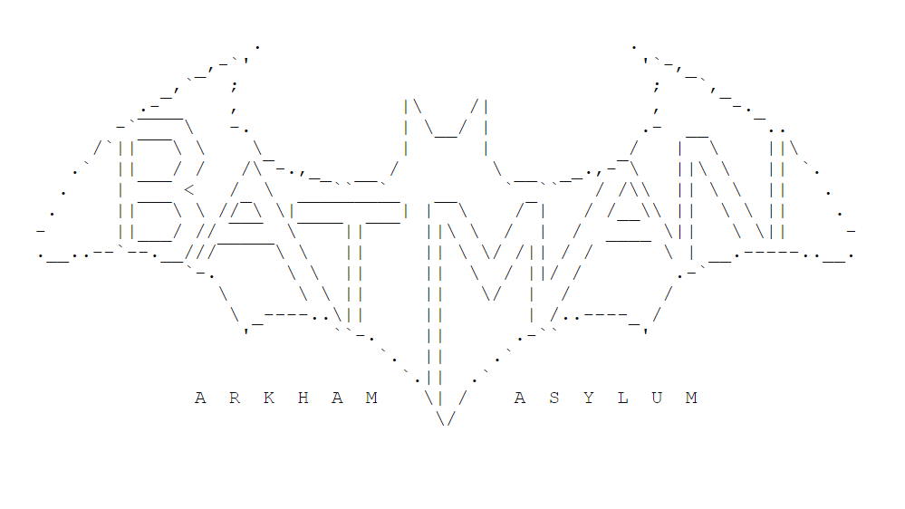
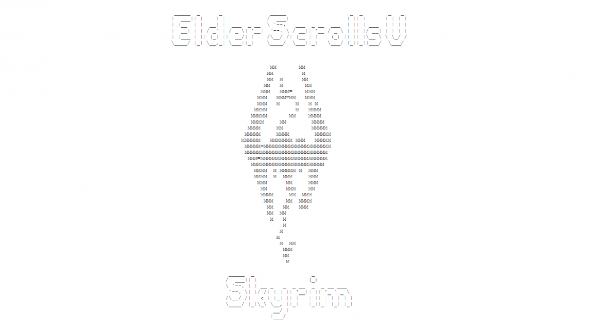
Guides like these started to fall out of use in the late 2000s and 2010s once websites got their act together with proper formatting, and ASCII art became less of a priority as a result. However, you can still find some lovely title art for more recent games. There’s a fun, massive Assassin’s Creed logo, an Arkham Asylum one in the iconic Batman bat shape, and Fable 2’s title rendered entirely out of the @ symbol (that guide is also notable for having an ingenious and user friendly chapter selection system using unique letter codes and the CTRL+F find function). And, obviously, there is always Skyrim:
So God bless you, the internet of 20 years ago. You weren’t better in every way, but better for having these amazing examples of creativity, love, and the indomitable spirit of man. A spirit that looked at the title of a game and whispered, “I bet you could recreate that using commas.”

